
Here's a reality that should make every telehealth operator uncomfortable: a significant portion of patients who start a checkout flow never complete it. Not visitors who bounce off a landing page. Not people who never clicked a CTA. These are patients who decided they wanted care, clicked 'Get Started,' and then disappeared somewhere between plan selection and payment confirmation.
That's not a marketing problem. That's a checkout problem. And if you're running on a generic platform checkout that wasn't purpose-built for telehealth, it's almost certainly happening to you right now.
We've spent years working inside telehealth operations, watching real session recordings, digging through funnel analytics, and rebuilding checkout flows from scratch. The patterns are remarkably consistent. The same friction points show up across weight loss clinics, hormone therapy providers, dermatology platforms, and mental health startups alike.
This post breaks down exactly where the leaks happen and what the highest-converting telehealth checkouts do differently.
The Core Problem: Generic Checkouts Weren't Built for Healthcare
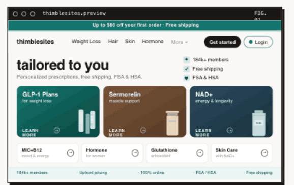
Most telehealth companies start with whatever checkout their platform gives them. Shopify, WooCommerce, a hosted form from their EHR vendor, maybe a Typeform stitched to a Stripe payment link. It works well enough to get the first hundred patients through the door.
But telehealth checkout isn't e-commerce checkout. You're not selling a pair of shoes. You're asking someone to share medical history, choose a treatment plan they may not fully understand, trust you with sensitive health information, and pay for a service they haven't received yet. That's a fundamentally different transaction, and it demands a fundamentally different flow.
Generic checkouts fail here because they treat every purchase the same. They optimize for speed-to-payment when what telehealth patients actually need is clarity, trust, and reassurance at every step.
Where Do Telehealth Checkouts Lose Patients?
When we audit telehealth checkout flows, the same four failure points come up over and over. Each one is fixable, but only if you know what you're looking at.
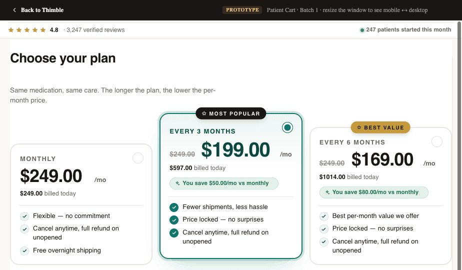
1. Plan Confusion
This is the single biggest conversion killer we see. A patient lands on the plan selection page and is confronted with three to five options, vague plan names, a pricing grid that requires a spreadsheet to decode, and no clear guidance on which plan is right for them.
In e-commerce, comparison shopping is fine. In healthcare, it triggers anxiety. Patients start wondering: Am I choosing the wrong thing? What if I pick the cheap plan and it doesn't work? What does 'comprehensive' even mean here? That uncertainty leads to tab-closing, not add-to-cart.
- Too many plan tiers with unclear differences between them
- Medical jargon in plan descriptions that patients don't understand
- Pricing that feels opaque or confusing (monthly vs. one-time, what's included vs. add-on)
- No recommended or default option to anchor the decision
2. Intake Form Friction
Telehealth checkouts almost always require some form of medical intake. The patient needs to answer health questions so a provider can evaluate them. This is non-negotiable from a clinical standpoint, but how you handle it makes an enormous difference in whether people finish.
The most common mistake is front-loading the entire intake before payment. You're asking someone who hasn't committed yet to spend 10-15 minutes answering personal medical questions. That's a massive ask, and the drop-off rates prove it.
- Lengthy forms presented all at once instead of broken into digestible steps
- Sensitive medical questions (sexual health, mental health history, substance use) asked too early without establishing trust
- No progress indicators, so patients don't know how much is left
- Redundant questions that feel like the system isn't paying attention
- Forms that don't save progress, so a page refresh means starting over
The irony is that most of this information doesn't need to be collected before payment at all. The provider needs it before the consultation, not before the transaction. That distinction matters.
3. Payment Trust Issues
Patients approach telehealth payments differently than they approach regular online purchases. There's an inherent skepticism: Is this legitimate? Will I actually see a doctor? What if the medication doesn't work? Can I get a refund?
Most checkout flows completely ignore this psychology. They slap a Stripe embed on the page and call it done. But a credit card form without context is a trust vacuum, especially for first-time telehealth patients who may have never paid for healthcare online before.
- No visible trust signals (security badges, HIPAA compliance mentions, provider credentials)
- No clear refund or satisfaction policy near the payment form
- Missing social proof at the moment of highest anxiety
- No explanation of what happens after payment (when do I see the doctor? how does this work?)
// PULLQUOTEThe moment a patient reaches your payment form is the moment of highest anxiety in the entire funnel. Everything on that page should be reducing doubt, not adding to it.
4. Mobile Experience Failures
The majority of telehealth checkout traffic comes from mobile devices. Yet most checkout flows are designed on a desktop and tested on a desktop. The result is a mobile experience that technically works but practically fails.
Small tap targets on plan selection cards. Multi-column layouts that collapse awkwardly. Form fields that trigger the wrong keyboard type. Payment forms that scroll behind the mobile keyboard. These aren't edge cases. They're the primary experience for the majority of your patients.
- Plan comparison grids that require horizontal scrolling on mobile
- Form fields too small to tap accurately, especially for older patients
- Checkout pages that aren't optimized for mobile page speed (slow load = abandoned session)
- Autofill and mobile wallet support missing or broken
How Do High-Converting Telehealth Checkouts Work?
The best telehealth checkout flows we've seen (and built) share a handful of characteristics. None of them are revolutionary on their own. But together, they compound into conversion rates that are dramatically higher than the industry average.
Clear, Guided Plan Selection
High-converting flows don't present plans as an open-ended choice. They guide the patient to the right plan. This can look like a short quiz ('What's your primary goal?'), a recommended badge on the most popular option, or even a single-plan flow where the only decision is yes or no.
The goal is to minimize cognitive load. The patient should feel confident they're choosing the right thing within 10 seconds of seeing the options. If your plan selection page requires reading and comparing, you've already introduced unnecessary friction.
- 01.Lead with the recommended plan, not a grid of equal options
- 02.Use plain language (not medical or marketing jargon) to describe what each plan includes
- 03.Show pricing clearly with no hidden fees or confusing billing cycles
- 04.Consider a guided quiz that narrows options before the patient sees a price
Progressive Intake: Ask Less Now, More Later
The best checkouts collect the minimum information needed to process payment and initiate care, then gather the rest after the patient has committed. This is the progressive intake model, and it works because it respects the patient's time and trust level at each stage.
Before payment, you need a name, date of birth, state of residence, and maybe two or three screening questions. Everything else, the full medical history, medication list, photo uploads, detailed symptom descriptions, can happen after checkout, during a post-purchase intake that the patient completes on their own time.
This approach also has a clinical benefit. Patients who have already paid are more invested in the process and tend to provide more thorough, honest answers to medical questions than patients who are still deciding whether to commit.
Healthcare-Specific Trust Signals
Generic trust badges (Norton Secured, McAfee Safe, etc.) don't move the needle in telehealth the way they do in e-commerce. Healthcare patients need healthcare-specific reassurance.
- HIPAA compliance messaging, positioned near form fields where patients enter sensitive data
- Provider credentials and licensing information visible during checkout
- Real patient testimonials (with appropriate consent) that address common concerns
- Clear explanation of the care process: what happens after I pay, when do I hear from a doctor, how do I get my medication
- Transparent refund and cancellation policies, not buried in a footer link
The most effective trust signal is also the simplest: showing the patient exactly what happens next. A short 'Here's how it works' section with three steps (pay, consult, receive care) reduces anxiety more than any badge ever will.
Mobile-First, Not Mobile-Friendly
There's a meaningful difference between a checkout that works on mobile and one that was designed for mobile. Mobile-first checkout means single-column layouts, large tap targets, minimal scrolling per step, native keyboard types for each input, and support for Apple Pay, Google Pay, and autofill.
It also means optimizing for speed. Every 100 milliseconds of load time costs you conversions, and mobile networks are less forgiving than desktop broadband. Based on operator observations, the highest-converting mobile checkouts load in under 2 seconds and can be completed in under 60 seconds.
- Design for thumb reach: primary actions in the bottom half of the screen
- Use step-by-step flows instead of long scrolling forms
- Support mobile wallets so patients don't have to type card numbers on a tiny keyboard
- Test on real devices, not just browser emulators
What Happens When Checkout Data Doesn't Flow?
Even if your checkout converts perfectly, you can still lose patients after they pay. This happens when checkout data doesn't flow cleanly into the systems that power the rest of the patient experience.
We see this constantly. A patient completes checkout, but their information doesn't make it to the EHR correctly. Or the CRM doesn't pick up the new patient record. Or the provider network doesn't get the intake data they need to initiate a consultation. Or the attribution data that marketing needs to optimize ad spend gets lost somewhere between the payment processor and the analytics platform.
Clean data routing means every checkout completion triggers the right downstream events: a patient record is created in your CRM, intake data is pushed to your EHR, the provider network is notified, and your attribution stack records the conversion with full source data. This sounds obvious, but getting it right requires your checkout to integrate deeply with your operational systems, not just your payment processor.
Why Does Checkout Attribution Matter for Telehealth?
Most telehealth companies are spending significant money on paid acquisition. If your checkout doesn't capture and pass UTM parameters, click IDs, and conversion events correctly, you're flying blind on which channels actually drive revenue. We've audited operations that were spending six figures a month on ads with no reliable way to trace a paying patient back to the campaign that brought them in.
Your checkout is the single point where marketing data and clinical data intersect. If that handoff is broken, both your growth team and your ops team are making decisions on incomplete information.
The Build vs. Buy Trap
When operators realize their checkout is leaking conversions, the instinct is usually one of two extremes: hack together fixes on their current platform, or rip everything out and build custom from scratch. Both approaches have real downsides.
Platform hacks (custom CSS, third-party plugins, embedded forms) create fragile systems that break with every platform update. Full custom builds take months, cost six figures, and require ongoing engineering resources most telehealth companies don't have.
The middle path that works best is a modular approach: purpose-built checkout tooling that's custom to your specific flow but doesn't require you to rebuild your entire tech stack. You should be able to swap out your checkout without touching your marketing site, your patient portal, or your clinical operations.
This is the philosophy behind tools like Thimble Cart. Instead of a one-size-fits-all template, the checkout is built around your specific plans, your intake requirements, your provider network, and your pharmacy relationships. It plugs into whatever systems you already use, whether that's a custom EHR, a third-party CRM, or a specific form builder your compliance team requires. No lock-in, no platform migration, just a better checkout that routes data where it needs to go.
A Practical Audit You Can Do This Week
Before you rebuild anything, run this quick audit on your current checkout. It takes about an hour and will tell you exactly where your biggest leaks are.
- 01.Pull your funnel data: What percentage of visitors who reach plan selection actually complete payment? Break this down by device type (mobile vs. desktop).
- 02.Go through your own checkout on a phone: Time it, count the steps, note every moment of confusion or friction. Do this as if you've never seen your product before.
- 03.Check your data flow: After completing a test checkout, verify that the patient record appears correctly in your CRM, EHR, and provider queue. Check that attribution data is intact.
- 04.Review your post-checkout experience: What email does a new patient receive? How quickly are they contacted by a provider? Where do patients get stuck after paying?
- 05.Look at your abandonment data: If your analytics can show you where in the flow patients drop off, you'll find that 80% of abandonment happens at one or two specific steps.
This audit won't fix anything by itself, but it will give you a clear, prioritized list of what to fix first. And in our experience, the top item on that list is almost always simpler than operators expect. Sometimes it's as straightforward as reducing the number of plan options from five to two, or moving half the intake questions to post-checkout.
The Bottom Line
Your telehealth checkout is not just a payment page. It's the highest-leverage conversion point in your entire business. Every percentage point you recover in checkout completion rate flows directly to revenue, and unlike ad spend, it doesn't require ongoing investment to maintain.
The fixes aren't mysterious. Guide plan selection instead of overwhelming it. Move intake questions to where they belong in the patient journey. Build trust with healthcare-specific signals, not generic badges. Design for mobile first. And make sure your data flows cleanly from checkout to every system that touches the patient experience.
If you're evaluating your checkout stack, look for tools that are modular, that work with your existing provider network and pharmacy relationships, and that give you the flexibility to iterate on conversion without rebuilding your entire platform. The days of accepting a 50% checkout abandonment rate as normal should be over.
Frequently Asked Questions
- What is a good telehealth checkout conversion rate?
- Checkout conversion rates vary widely. Well-optimized telehealth flows materially outperform generic ones, but specific benchmarks should be measured against your own funnel rather than industry averages. The gap between optimized and generic checkouts is almost always caused by plan confusion, intake form friction, missing trust signals, and poor mobile experience, all of which are fixable without a full platform rebuild.
- Why do patients abandon telehealth checkout?
- The four most common reasons are plan confusion (too many options with unclear differences), intake form friction (too many questions asked too early), payment trust issues (no healthcare-specific reassurance near the payment form), and mobile experience failures (checkout flows designed for desktop but used on phones). Each one is fixable independently.
- Should intake come before or after payment in telehealth?
- Collect the minimum information needed to process payment before checkout, typically name, date of birth, state, and a few screening questions. Move the full medical intake to post-checkout. Patients who have already paid are more invested and provide more thorough answers. This progressive intake model consistently improves completion rates.
- How do you optimize a telehealth checkout for mobile?
- Design mobile-first, not mobile-friendly. Use single-column layouts, large tap targets, step-by-step flows instead of long scrolling forms, native keyboard types for each input, and support for Apple Pay and Google Pay. Based on operator observations, the highest-converting mobile checkouts load in under 2 seconds and can be completed in under 60 seconds.
Building a telehealth brand?
Thimble Hub gives you the checkout, intake, patient portal, and EHR-routing infrastructure so you can launch in weeks, not quarters. Modular, HIPAA-ready, no lock-in.